I have a custom keypad that is a form (called Keypad) with a height of 165. In my Global Code is set the top of the keypad form so that it is at the bottom of the screen (hidden). I then use “translateY(-165px)” or “translateY(165px)” to show or hide it when required.
I’m having a big issue setting the top of the keypad’s form to make this work for any device I encounter.
I’ve been using “Keypad.Top=window.innerHeight-20”, which works for an iPhone 5 and 6+, but this does not work for the newer iPhones without a “home” button. To show the entire Keypad form with those devices I’d need to subtract 40-60 from “window.innerHeight”.
Is there a more reliable way to find dead bottom of the useable screen?
Here’s a function I wrote that get’s the height of the document (the html file). This works well if you have the header stuff setup correctly (see below).
function getDocHeight()
{
  // per MDN: element.scrollHeight - element.scrollTop === element.clientHeight

  var D = document;
  return Math.max(
      D.body.scrollHeight, D.documentElement.scrollHeight,
      D.body.offsetHeight, D.documentElement.offsetHeight,
      D.body.clientHeight, D.documentElement.clientHeight
  );
}
If you have jQuery in your project, you should be able to use this:
$(window).height();
Lastly, here’s what needs to be in your html header:
Screen coordinates are expressed in x,y with x being the horizontal (width) axis and y being the vertical (height) axis. So, 0,0 is the top left corner.
In order to make your keyboard work on all devices, you need to get the height of the screen. The height_of_the_screen - the_height_of_ the_keyboard = where you put the top of the keyboard.
The reason your window.innerHeight isn’t working is because the screen resolutions are changing and as they change, -40px on one device will NOT render the same results on a device with higher resolutions.
Your code gives the same result as window.innerHeight on my iPhone 5 and 6+ (548 and 716). Maybe it will be different on a 12.
For my form to show and hide properly I need to set it to 528 (iPhone 5) and 696 (6+).
Another thing I’m having trouble understanding is that if you select defaultformsize to iPhone 5 under properties, the form height is 548. For the 6+ it’s 736.
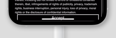
It looks like the issue just isn’t with my keypad form, but even with the built in EULA form:
Not sure how far from the bottom of the screen the EULA “Accept” button is supposed to be, but it looks about 20-40 lower than it should be on an iPhone 12.
My defaultformsize is iPhone 5. I wonder if these issues are due to AppStudio setting the designHeight for the iPhone 5 to 548 instead of 568. If I choose defaultformsize to be 6 Plus the designHeight is 736. I don’t understand the inconsistency.
Bob
Correction: What I have above isn’t correct. The EULA button is too low for phones without a home button, but it’s consistently right at the bottom of the screen.
Thanks for suggesting using a percentage! I changed my code to "Keypad.Top=“100%” and so far it’s working, both in the Safari browser and when added to home screen. I just need to do a bit of verification on newer devices that don’t have a home button.