I use a simple loop to fill a Bootstrap Listgroup.
for (i = 0; i  <= 14; i ++)
{
  ListGroup1.addItem( i);
  NSB.$("ListGroup1_" + i).innerHTML = "Test " + i + "<span class=" + '"' + "badge badge-primary" + '"' + ">"  +   i   +  "</span></button>";
}
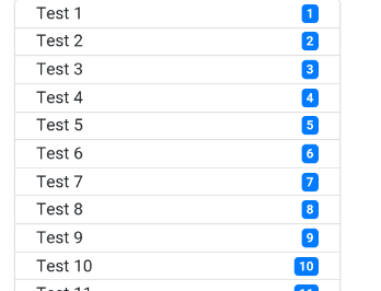
When i run it with Chrome on my PC, it looks like this
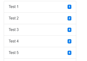
but when i run the same thing on my phone, it looks like this (the items are squashed up)
The ListGroup height is set to ‘auto’ and the style property has the following:
max-height: calc(100% - 150px); overflow:scroll;
Any help on why this is the case is greatly appreciated. Thanks