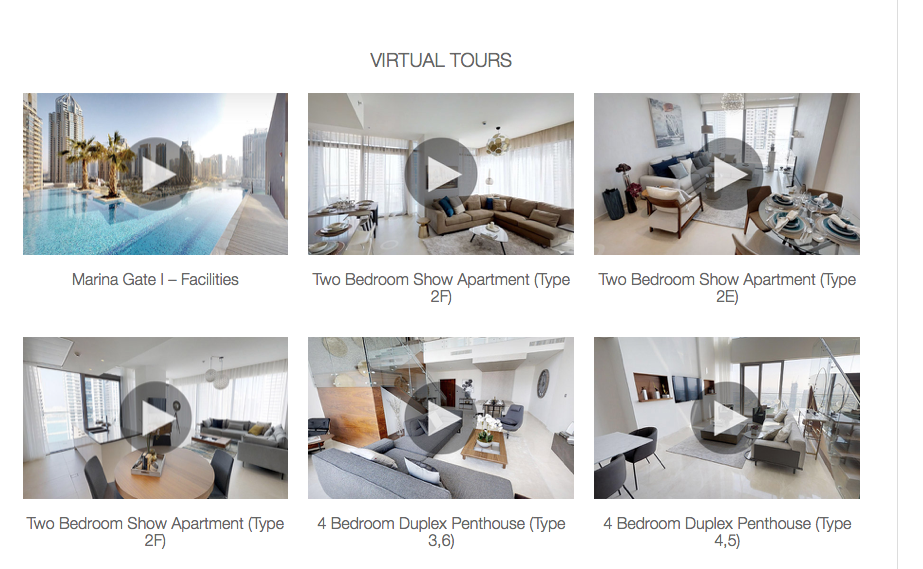
Hi guys, I need to replicate the attached image. Into a responsive design. ie wide format 3 images across going down to 1 on phones.
I have used the gridColumn and gridRows as these adapt well but only with data at design time.
I have the image urls and the title text stored in a MYSQL database and know how to do the ajax call to get a json array from the server.
Anyone used any of the bootstrap components to do this or played around with a ‘gallery’ library within nsBasic ?
Cheers
Steve Warby
Are you referring to the PhotoGallery control? It’s suited for a slide show of images. There’s a sample: give it a try.
If you’re using the Bootstrap image control, it’s easy to set at runtime:
Image1.src = "https://www.nsbasic.com/contest.jpg"
hi there… another option can be to generate img objects on the fly. if you put them inside a container you can make it scrollable.
I presume I need to do the following on the fly.
Loop through the array
get the image address - title - link address
create a GridColumn & GridRows for each item.
I really I need to show three columns on wide screen and one on mobile.
I can do this at runtime but no idea how to create from a json array.
Cheers
Steve Warby
I use bootstrap controls so I presume I cannot mix with jqWidgets.???
Cheers
Steve Warby
The grid rows and columns can be made in advance - you only have to change the src on the image controls at runtime.
Bootstrap Grids can be set up to have different numbers of columns, depending on the screen width:
http://wiki.nsbasic.com/Bootstrap_Grids
jqWidgets + Bootstrap is no problem. It’s jQuery Mobile which does not play well with others.
The issue is the number of images will change in the database so I cannot create the correct number of rows/columns at design time.
How do I loop through a JSON array and build after the Ajax call.
The Json would be:
{"data":[{"DT_RowId":"row_1","anims":{"animID":"1","title":"Marina Gate I Facilities","url":"www.mydubaidream.com\/imageAssets\/dubaiLogo1.png","status":"active"}},{"DT_RowId":"row_6","anims":{"animID":"6","title":"Test Flipbook 1","url":"www.mydubaidream.com\/imageAssets\/dubaiLogo2.png","status":"active"}}],"options":[],"files":[]}
Cheers
Steve Warby
Is there a maximum? It will be easier to hide rows that you don’t need than to create rows on the fly at runtime.
Otherwise, you’ll probably need to do some code using cloneNode and appendChlld.
Hi guys,
making progress but can’t get what I need.
In the example on button1 click. I am duplicating the gridColumn but the on click event only happens on the last image.
I am trying achieve the following 
-
Once I am using an array I need to know which image I have clicked ( at the moment I am using var inc ) so on each image click I can then work out which element in the array has been clicked. (. ie show a popup with info from element 1-2-3 etc)
-
The second thing I am trying to achieve is have the gridColumns spread centrally across the screen. So on a large screen have 3 columns all with the images central. Medium screen 2 columns all with the images central. Small screen1 columns all with the images central. All with the gridRow width 100%
What am I missing here please.
Cheers
Steve Warby
Archive.zip (6.7 KB)
Making progress. Thanks for the help so far.
www.mydubaidream.com/childNodes2
ref 1 above.
I though if I add the class ‘testImage’ to the duplicated gridColumn I could then use
$(document).on('click', '.testImage', function () {
     alert("Class clicked, id "+this.id+", text"+this.innerHTML);
});


var inc = 0;
Button1.onclick=function(){
  inc=inc+1;
  $('#GridColumn1')
        .clone(true,true)
        .attr('id', inc)   // <-- Note this line
        //.attr('class', 'img-responsive center-block collapse in testImage')
       //.attr('class', 'testImage')
        .insertBefore("#GridRow1");
}
When I add the class
.attr('class', 'testImage')"
I get my click event but lose the formatting. I tried adding
.attr('class', 'img-responsive center-block collapse in testImage')
What am I screwing up here.
ref.2 above.
I was not understanding the concept correctly. I have set the image to centre = true and the column sizes to 3-4-6-12 respectively.
So this now flows nicely and the images are central.
However on iPhones android phones I would prefer the landscape mode to show 2 images side by side. Can I override the setting that size-sm kicks in ?
- The next step is to replace the image in the cloned gridColumn with another image from the array. How do I change that image when cloning. e.g. cloned.image1.scr = ‘www.linktoimage’
Cheers
Steve Warby
One step further
www.mydubaidream.com/childNodes3
click on get Iframes no class.
when the Ajax returns the data
function returnedIframes() {
     var i =0;
     var newID;
     var newImage;
     var newTitle;
     if (iframesReturned1.status == 200) { //success
          //alert('data back '+ iframesReturned1.responseText);
          dataReturned = JSON.parse(iframesReturned1.responseText);
          var newArray = [];
          newArray = dataReturned['data'];

        for (var i = 0; i < newArray.length; i++) {
        newID =  'animID'+newArray[i]['anims']['animID'];
        newDiv = $('#animID0')
        .clone(true,true)
        .attr('id', newID)   // <-- Note this line
        //.attr('class', 'testImage')
        .insertAfter("#gridRow1");
        newImage = newArray[i]['anims']['thumbnail']; //'http://www.mydubaidream.com/imageAssets/blogPage3.svg';
        newTitle = newArray[i]['anims']['title'];
        $(newDiv).find("img").attr("src",'http://'+newImage);
        $(newDiv).find("container").attr("innerHTML",newTitle);
            console.log(newArray[i]['anims']);
            console.log(newArray[i]['anims']['animID']);
            console.log(newArray[i]['anims']['thumbnail']);


}
        animID0.hidden = true;
}
}
I now need to do the following:
- I have the title in a container How do I change the text in the cloned container. I tried
$(newDiv).find("container").attr("innerHTML",newTitle);
- I have another field ‘url’ which contains the data for another container on a pop up form ( which is an iframe ). How do I add a click event for each cloned div. ie on click alert (newArray[i][‘anims’][‘url’]);
Im still struggling with adding a class as the following
.attr('class', 'testImage')
screws the size-lg etc etc.
eg click on get iframe add class
cheers
Steve Warby
I now have the following working as expected if anyone needs to re-create the layout.
The problem I have with the ‘click on class event’ was I had a datable on the form that was ’ getting in the way’ of the gridrows
function returnedIframes() {
     var i =0;
     var newID;
     var newImage;
     var newTitle;
     var newURL;
     if (iframesReturned1.status == 200) { //success
          //alert('data back '+ iframesReturned1.responseText);
          dataReturned = JSON.parse(iframesReturned1.responseText);
          var newArray = [];
          newArray = dataReturned['data'];

        //for (var i = 0; i < newArray.length; i++) {
        for (var i = newArray.length - 1; i >= 0; --i) {
        newID =  'animID'+newArray[i]['anims']['animID'];
        newDiv = $('#GCanim')
        .clone(true,true)
        .attr('id', newID)   // <-- Note this line
        //.attr('class', 'testImage')
        .insertAfter("#GRanim");
        newImage = newArray[i]['anims']['thumbnail']; //'http://www.mydubaidream.com/imageAssets/blogPage3.svg';
        newTitle = newArray[i]['anims']['title'];
        newURL = newArray[i]['anims']['url'];
        $(newDiv).find("img").attr("src",'http://'+newImage);
        $(newDiv).find(".cont1").html(newTitle);
        $(newDiv).find(".cont2").text(newURL);
            console.log(newArray[i]['anims']);
            console.log(newArray[i]['anims']['animID']);
            console.log(newArray[i]['anims']['thumbnail']);


}
        GCanim.hidden = true;
}
}
The finale issue I am having ( hopefully ) is
On iPhones & Android phones I would prefer the landscape mode to show 2 images side by side. Can I override the setting that size-sm kicks in ?
Cheers
Steve Warby
Also is there an event I can capture when the size-lg - md - sm -xs are triggered so I can adjust some font sizes at the same time,
Cheers
Steve Warby
With regard to changing some CSS (like font-size) as the various break points are reached, you can set some media queries in your Project CSS.
This page may help:CSS · Bootstrap
/* xs range */
@media (max-width: 767px) {
  .your-classname {
    font-size: 10px;
  }
}
/* sm range */
@media (min-width: 768px) and (max-width: 991px) {
  .your-classname {
    font-size: 12px;
  }
}
/* md range */
@media (min-width: 992px) and (max-width: 1199px) {
  .your-classname {
    font-size: 14px;
  }
}
Kind regards,
Doug
I presume these triggers are within the bootstrap code somewhere.
Where can I find them ?
Cheers
Steve Warby.
The triggers are typically referred to as break points, and each CSS framework tends to choose their own defaults for each screen size. The default Bootstrap 3.3 grid break points can be found at the URL I mention above.
As far as I know, you can’t change Bootstrap’s break point defaults from within AppStudio, but you can modify what happens when the break points are triggered, and you can also add your own additional break points and styling using @media queries such as I’ve suggested above.
On that note, I’ve updated my earlier answer to include a CSS selector around the font-size lines. My example uses a class name, but of course you could use a selector id or body tag, or whatever is needed, including the use of multiple selectors. Sorry about forgetting that.
Kind regards,
Doug
Thanks for the insight Doug,
I was hoping there would be a way to change the setting somewhere in the depths of the framework…
Cheers
Steve Warby